Google Planner
An laid-back planner for spontaneous spirits
Context
Hackathon @Tufts
Timeline
1 week in Feb 2022
My role
UX & UI Designer
Achievement
Runner-Up
Disclaimer: this is a concept project that is not officially affiliated with or sponsored by Google
COMPETITORS
2 Types
Out of the 3 themes given at the hackathon, our team chose "productivity & efficiency.” We then identified 2 popular types of productivity products & analyzed 1 example for each category
Google Calendar
Type 1: calendar apps
Asana
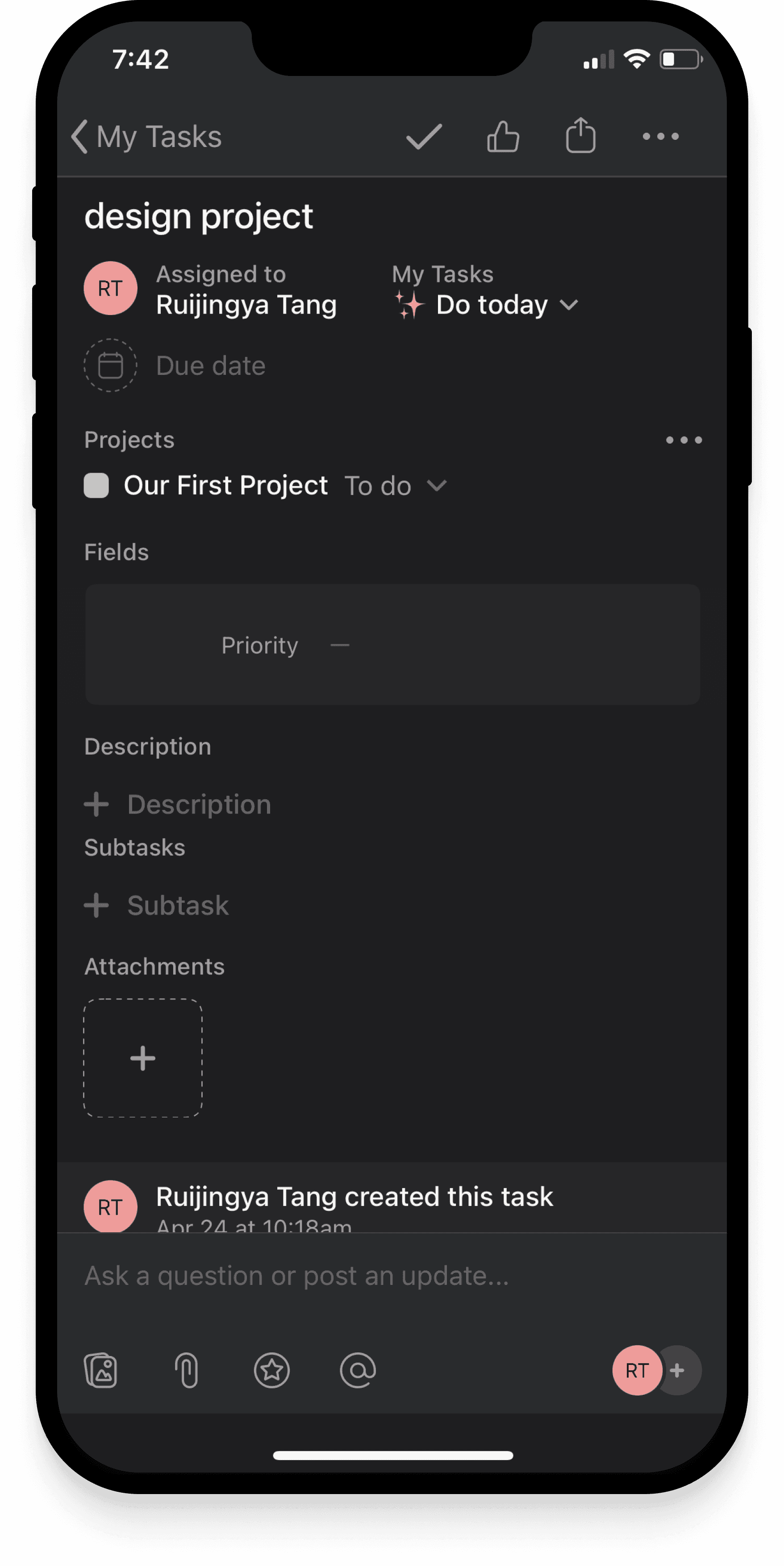
Type 2: Task management apps
Shared Characteristics
Structurally complex & afford diverse editing & organizational features
Display exact task start & end time ; allow unlimited tasks per day
It seemed that…
Many existing productivity tools primarily facilitate effortful & precise planning, which is helpful for some but stressful for others.
PERSONAS
Who's Planning; Who's Not?
There are 3 types of planners (or non-planners) that most of us have met at some point.
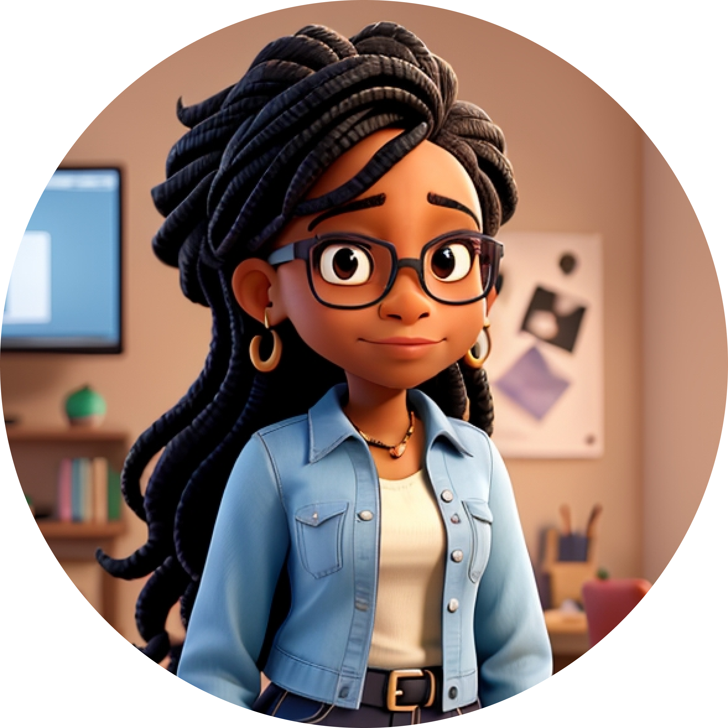
The Organized Boss
Plans even their leisure activities down to the minute
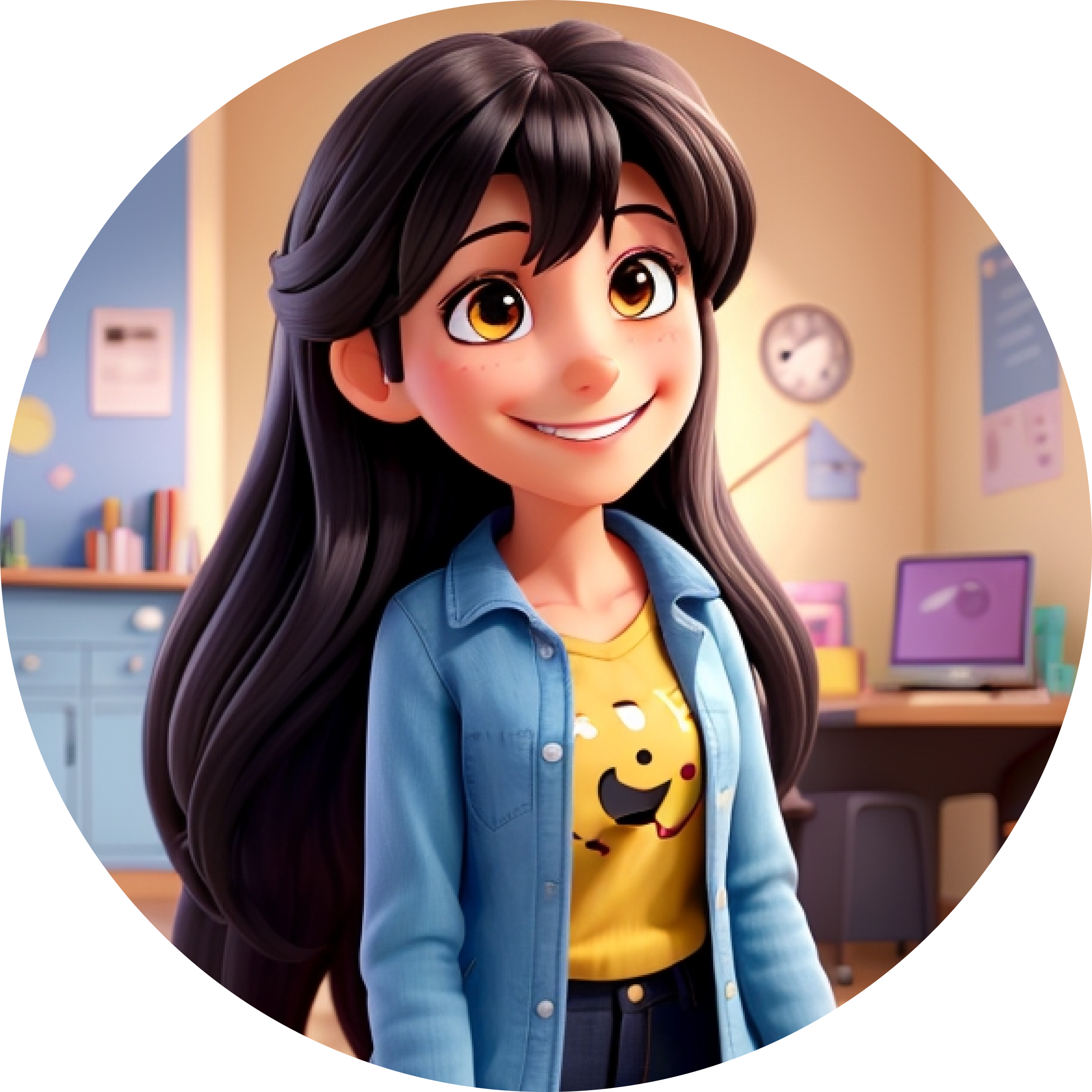
The YOLO Friend
Comfortably plays everything by the ear
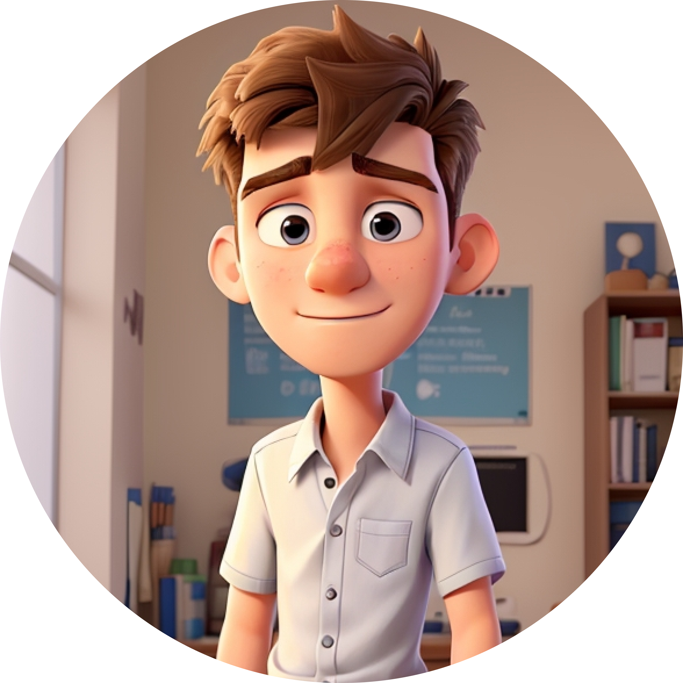
The Aspiring Planner
Wants to plan but is scared of the work & stress involved
Target User
Who's Good to Go?
Both the organized boss and the yolo friend should rest assured. The former is satisfied with existing products like Google & Asana, while the latter is comfortable without any planner tools.
Who's Left Hanging?
The aspiring planner
wants to somewhat manage their time with a scheduling tool that’s not too complex and demanding & is left with few existing tools at their disposal.
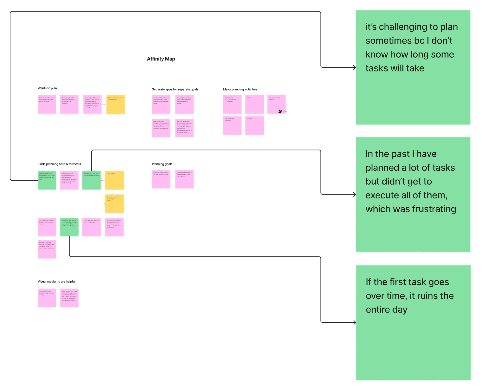
A snapshot of the affinity map from user interviews
Design Question
How might we make planning stress-free?
DESIGN - V1
Build First, Revise Later
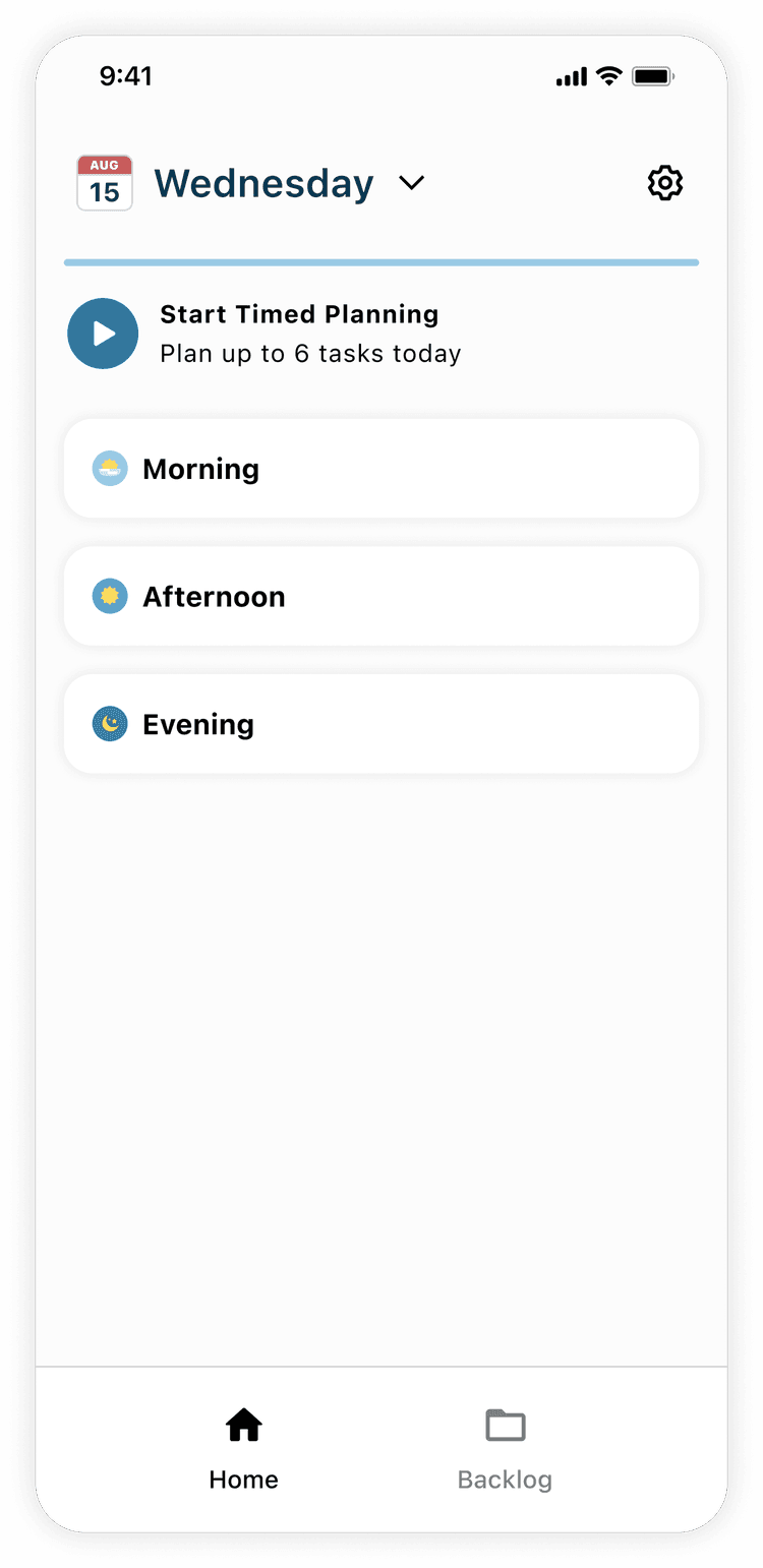
At the Hackathon, our team prioritized building screens to communicate the UX before fine-tuning the UI. Therefore, at that time, we did not ground our designs within an existing design system.
Key Features
1
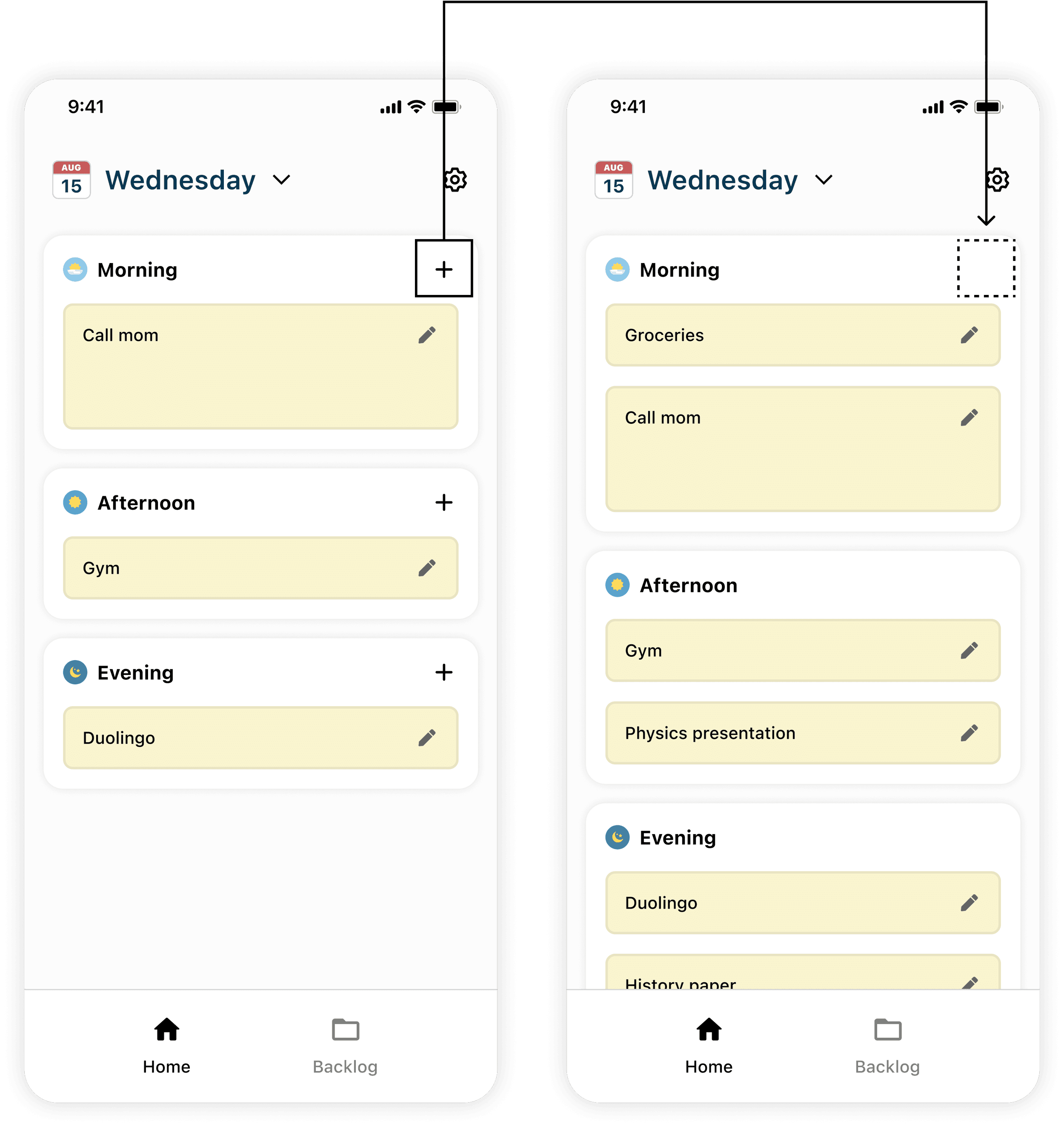
Generally time boxes
Traditional Approach
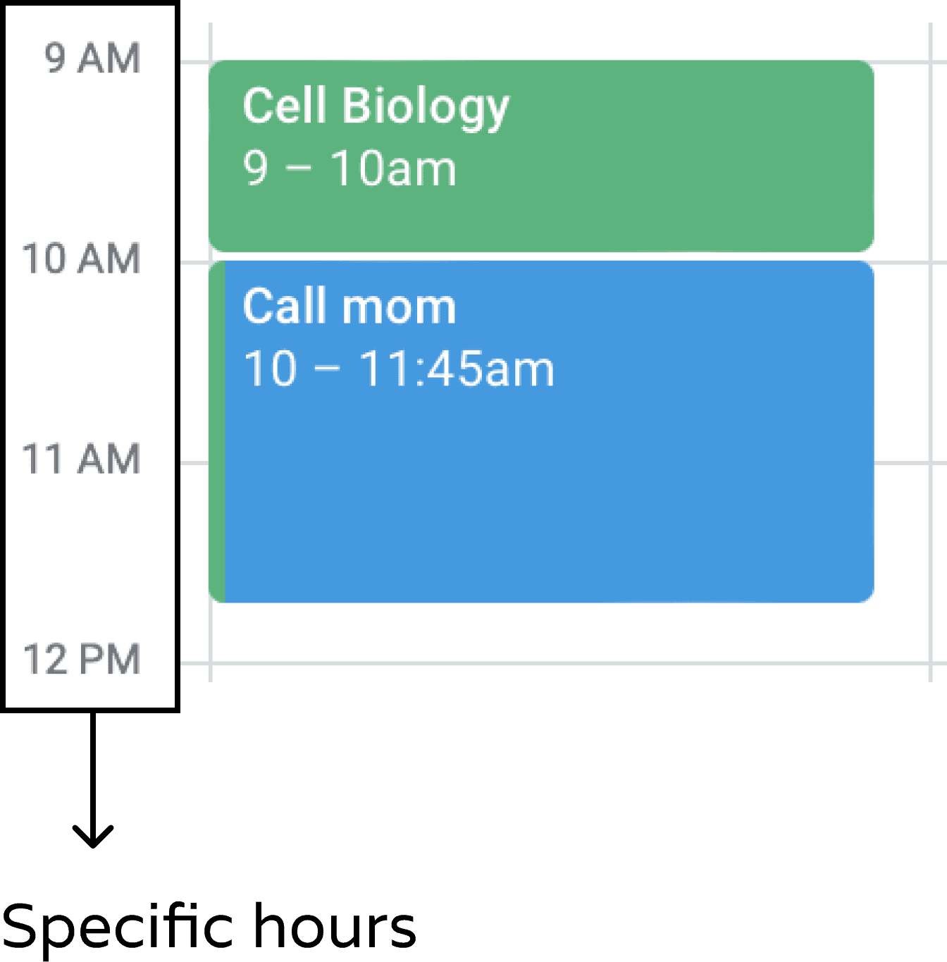
Our Approach
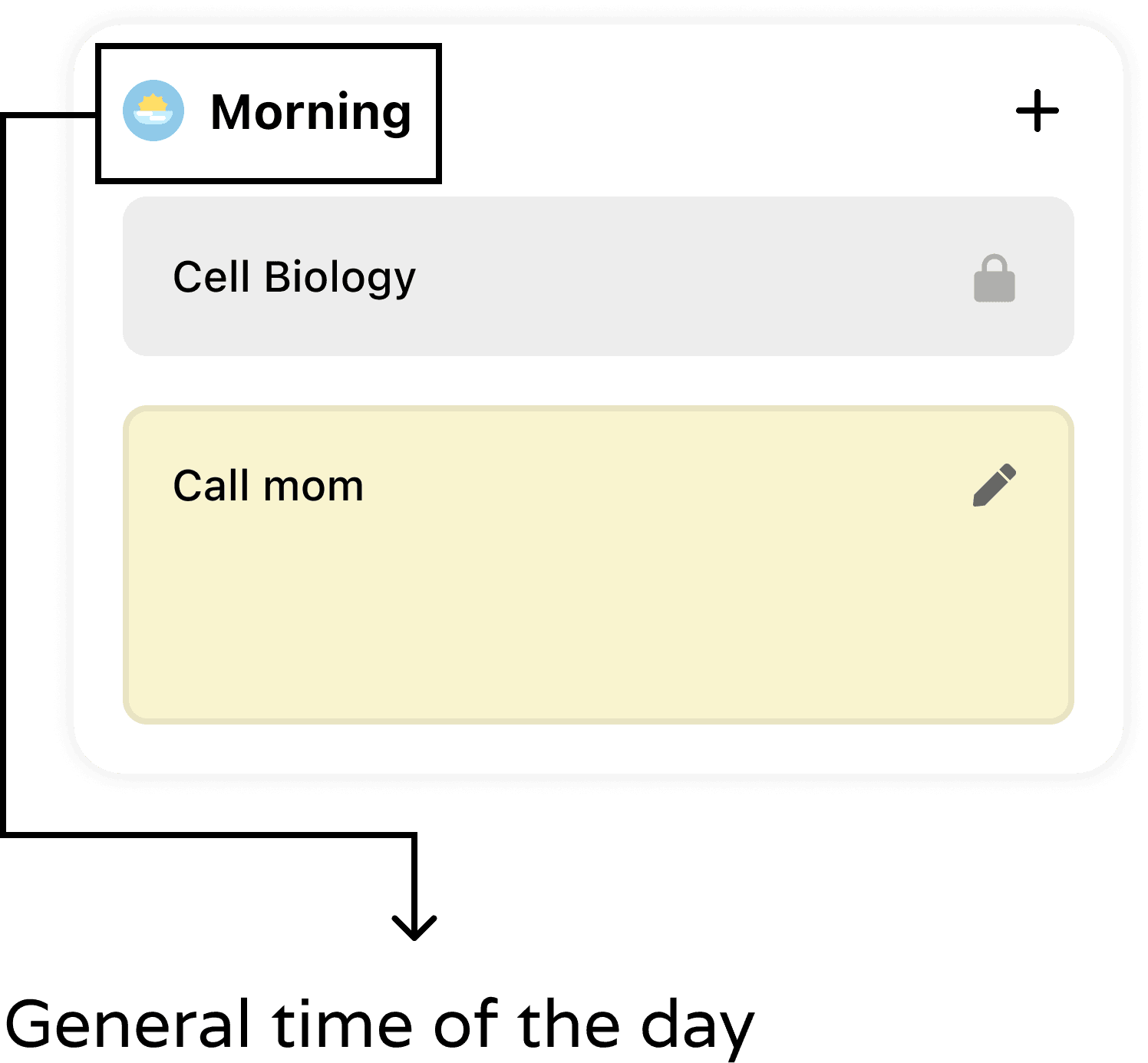
2
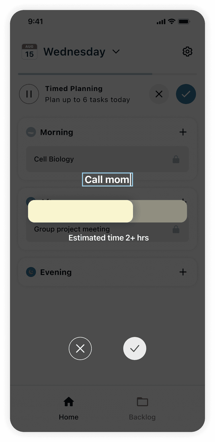
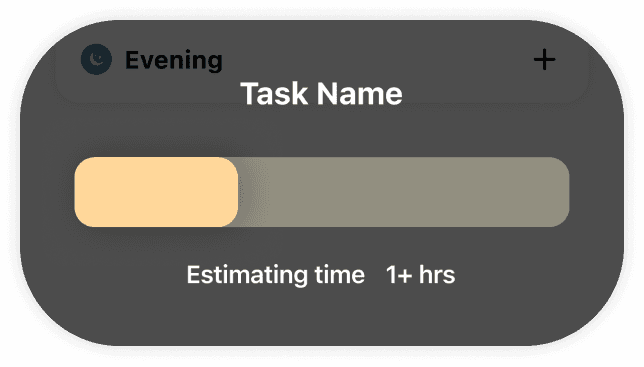
Task durations are estimated, not exact
Our app simply asks users to estimate the duration of a task by dragging a bar. To help the user escape the stress of not finishing a task at the exact minute that it’s planned to end.
Design Inspiration
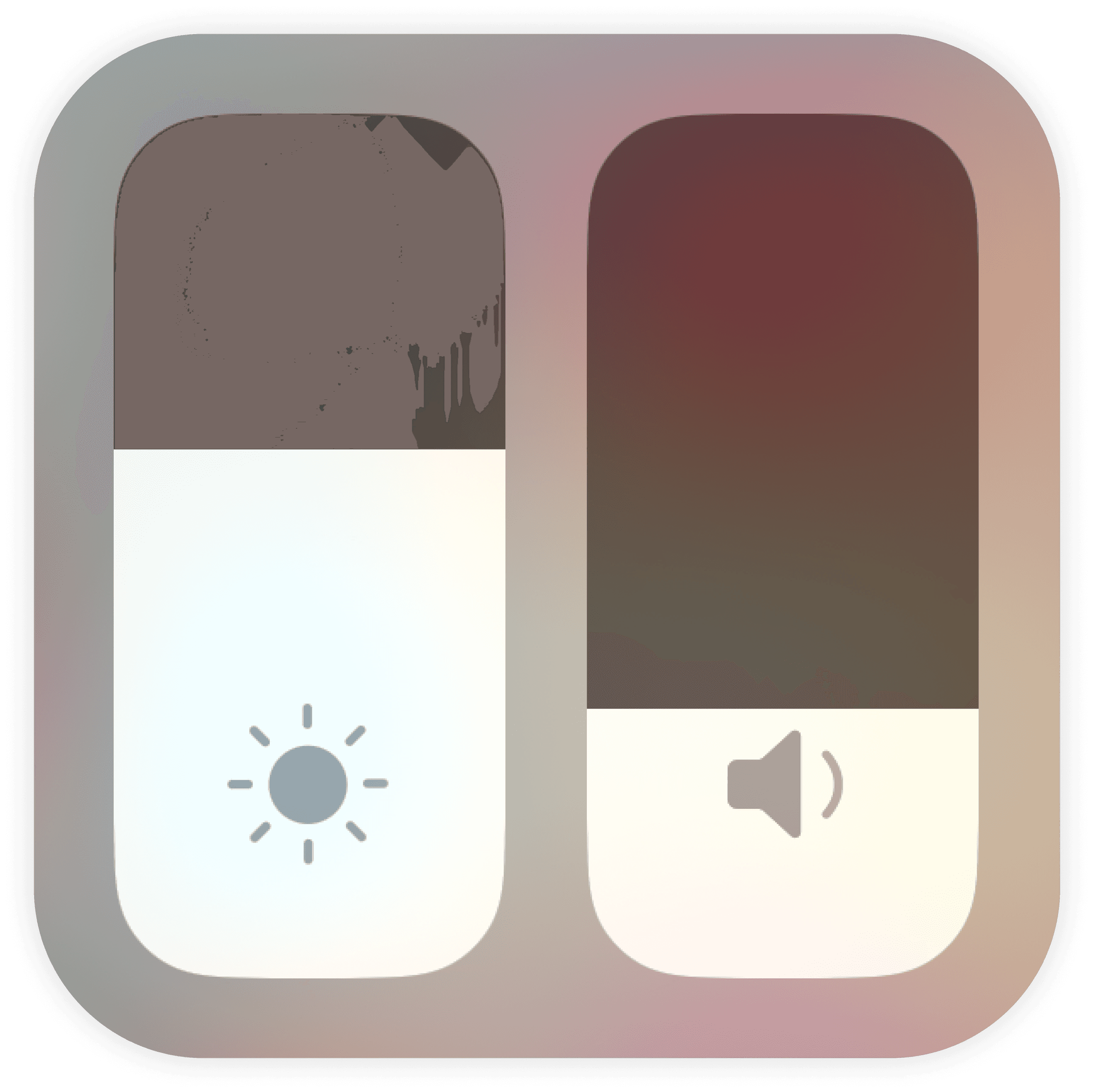
The iOS UI for volume and brightness adjustment. but ours is horizontal to align with how people conceptualize physical qualities:
Volume is "high" → vertical
Duration is "long" → horizontal
3
Constraints for Task Prioritization
Although the word “constraint” often gets frowned upon, it sometimes clears our minds.
Therefore, our app introduced 2 limiting features that nudge the user to prioritize most important tasks & avoid getting overwhelmed.
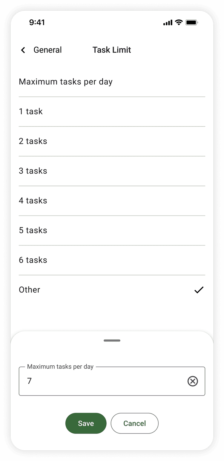
Limited number of tasks
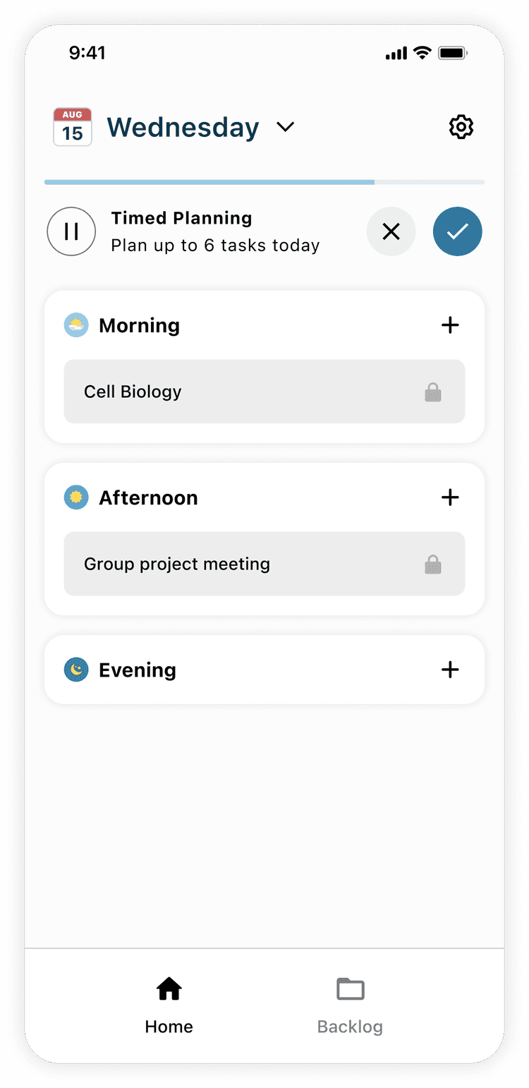
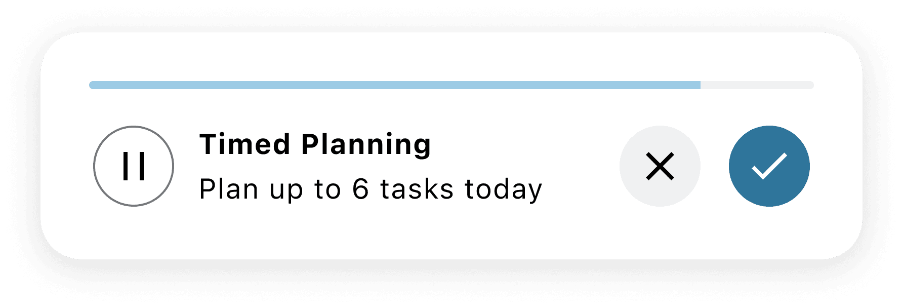
The user can add up to only 6 tasks per day.
Limited time to plan
The user will be timed when adding tasks.
4
Imported Events
The user can imports events from external apps such as Google calendar to see mandatory commitments and plan tasks accordingly.
The user will be timed when adding tasks
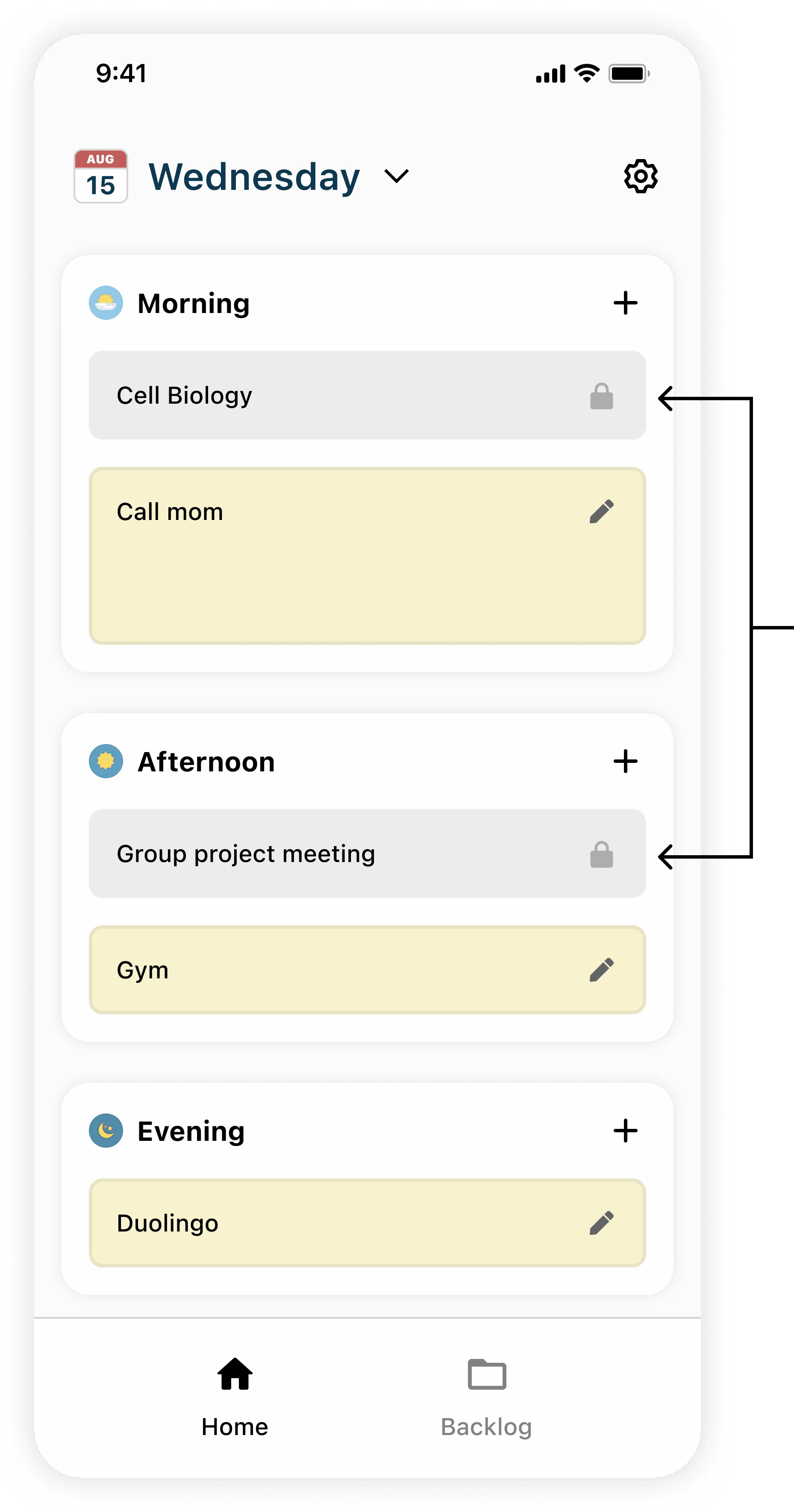
Imported mandatory commitments
TESTING
Removing Features
Limited to add task
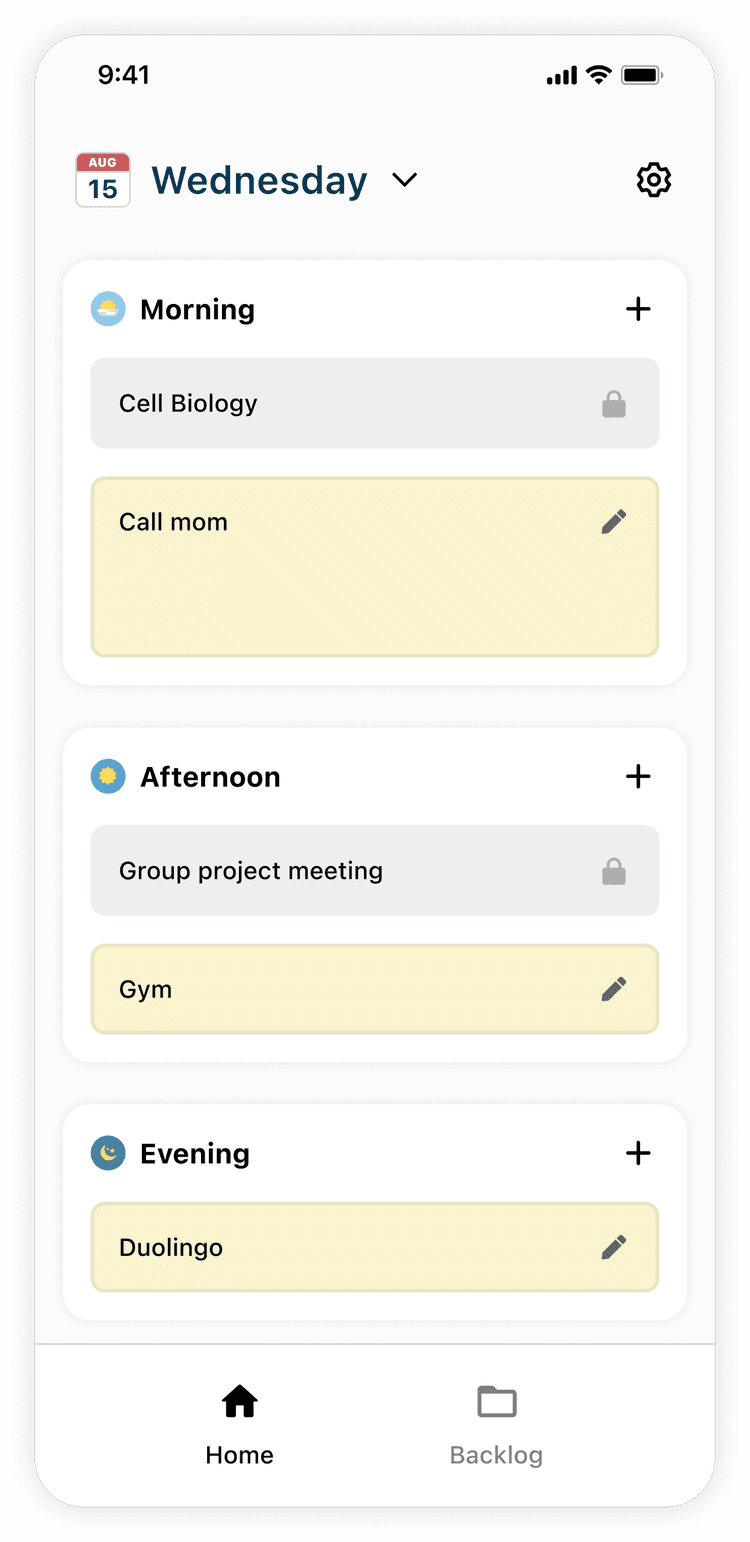
The feature, originally designed to nudge users to prioritize the most important tasks, ended up causing them too much stress that practically prevented them from planning.
“Being timed just makes me panic and freeze”
—— User
Adding Features
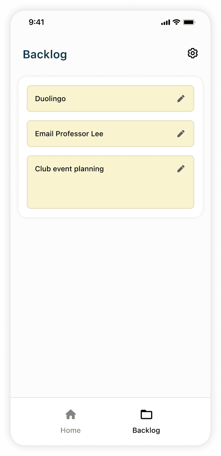
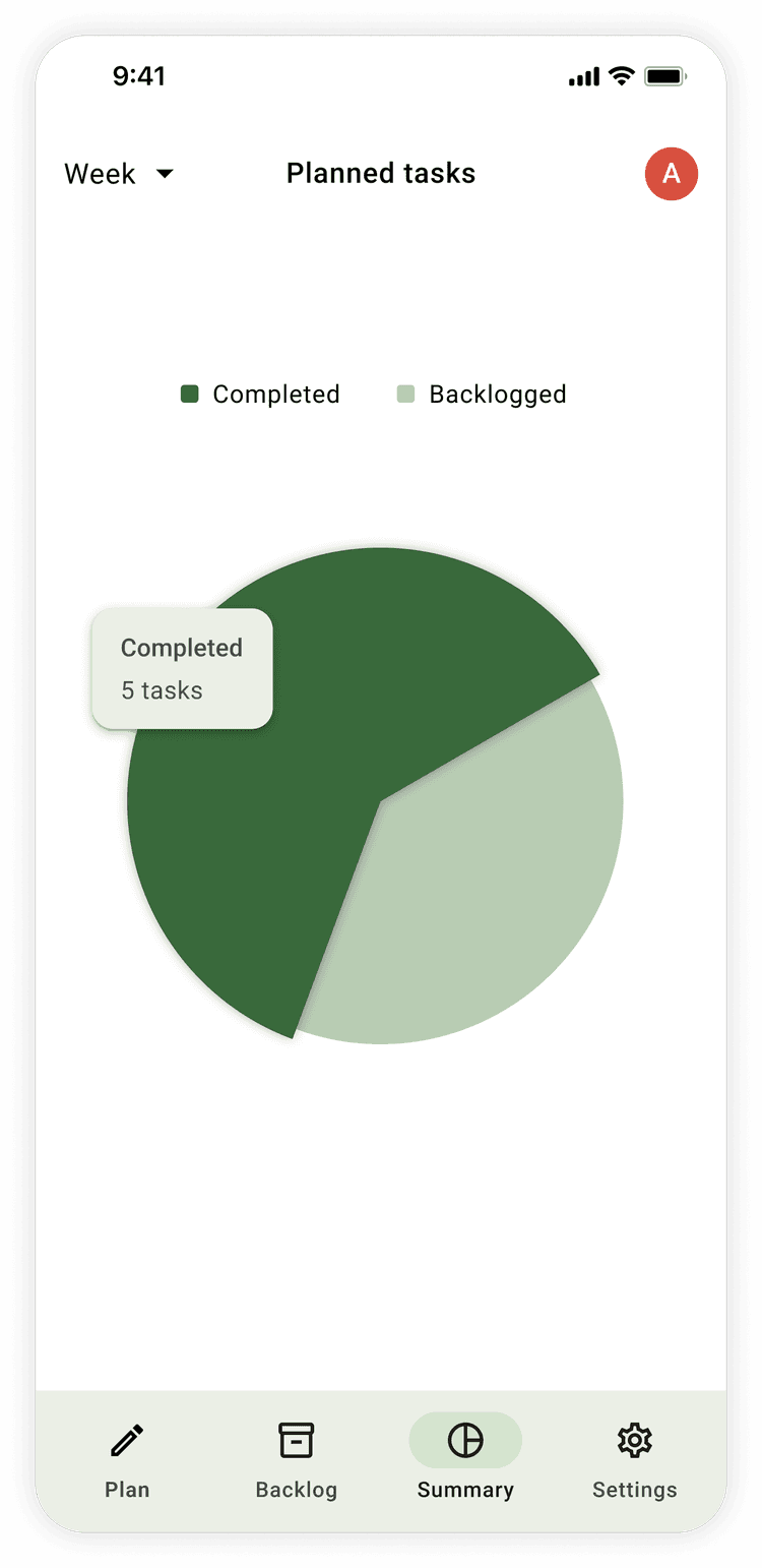
Our user also expressed a desire to see records of their past task, which would help them learn about their work capacities and become better planners
DESIGN - V2
Adopting the Material Design System
As a fun learning exercise, I decided to add some constraints to the UI design of our project, using Google’s latest design system: Material You.
Design Decisions
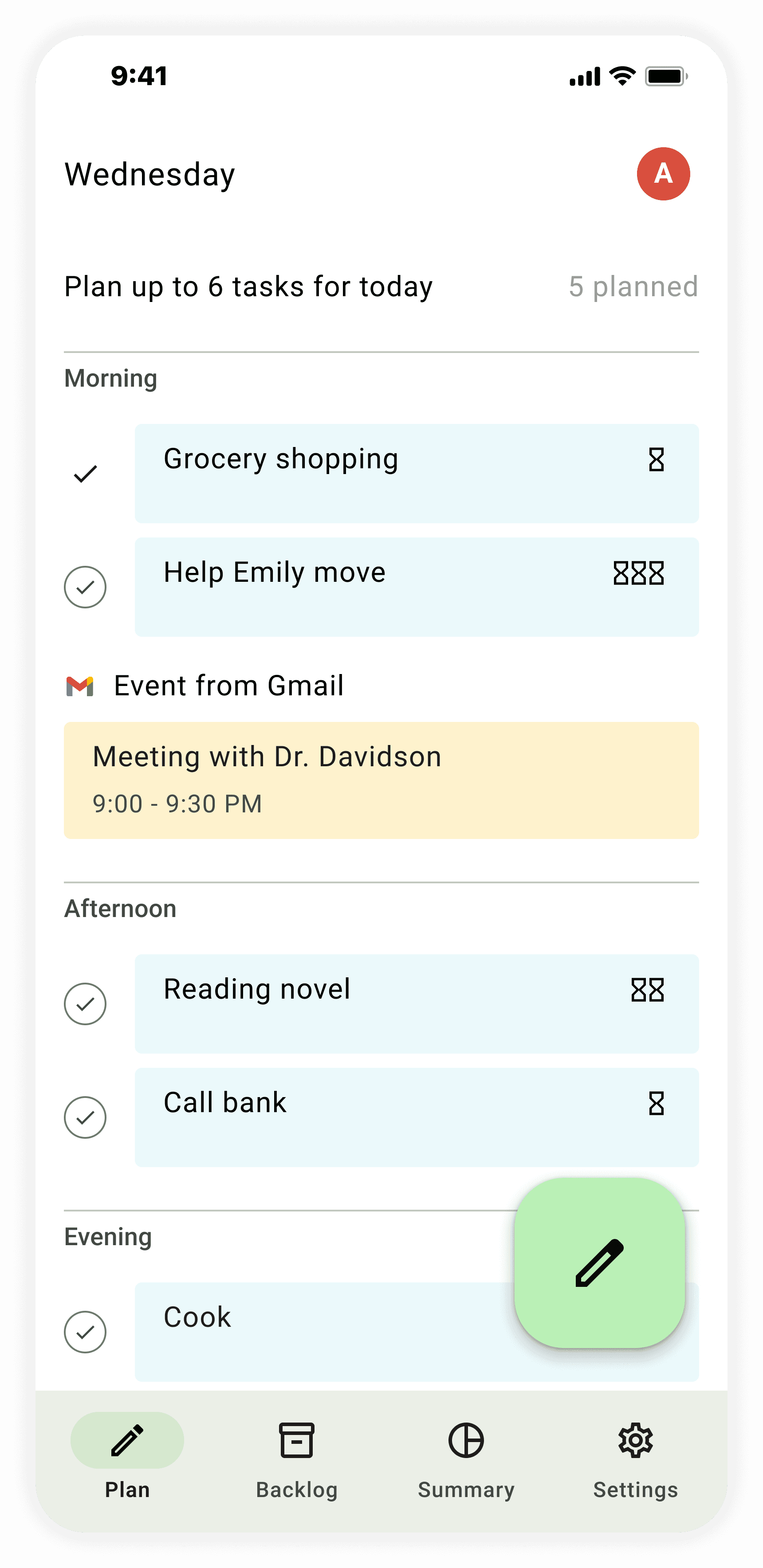
Task Duration Signage
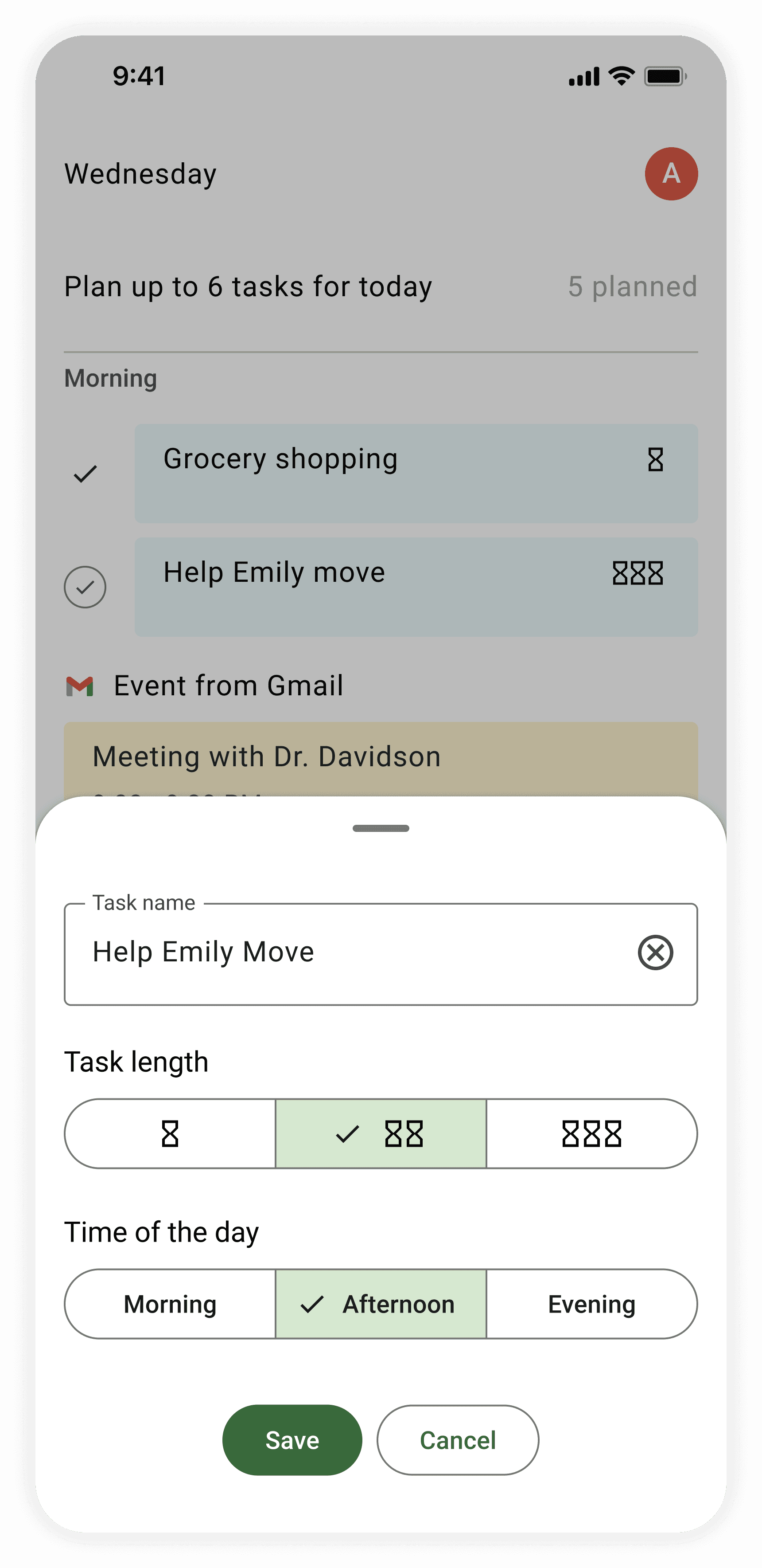
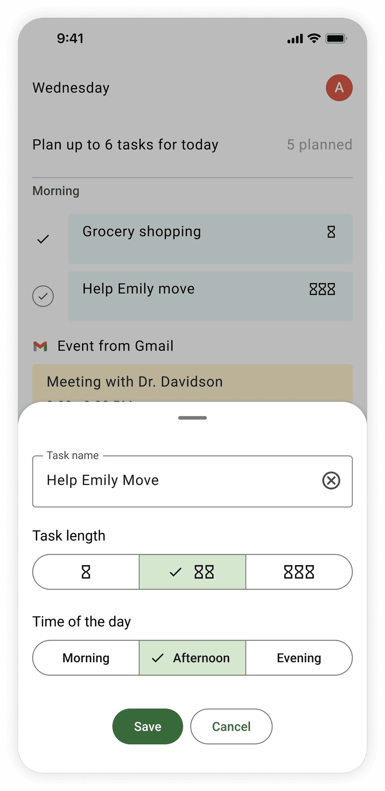
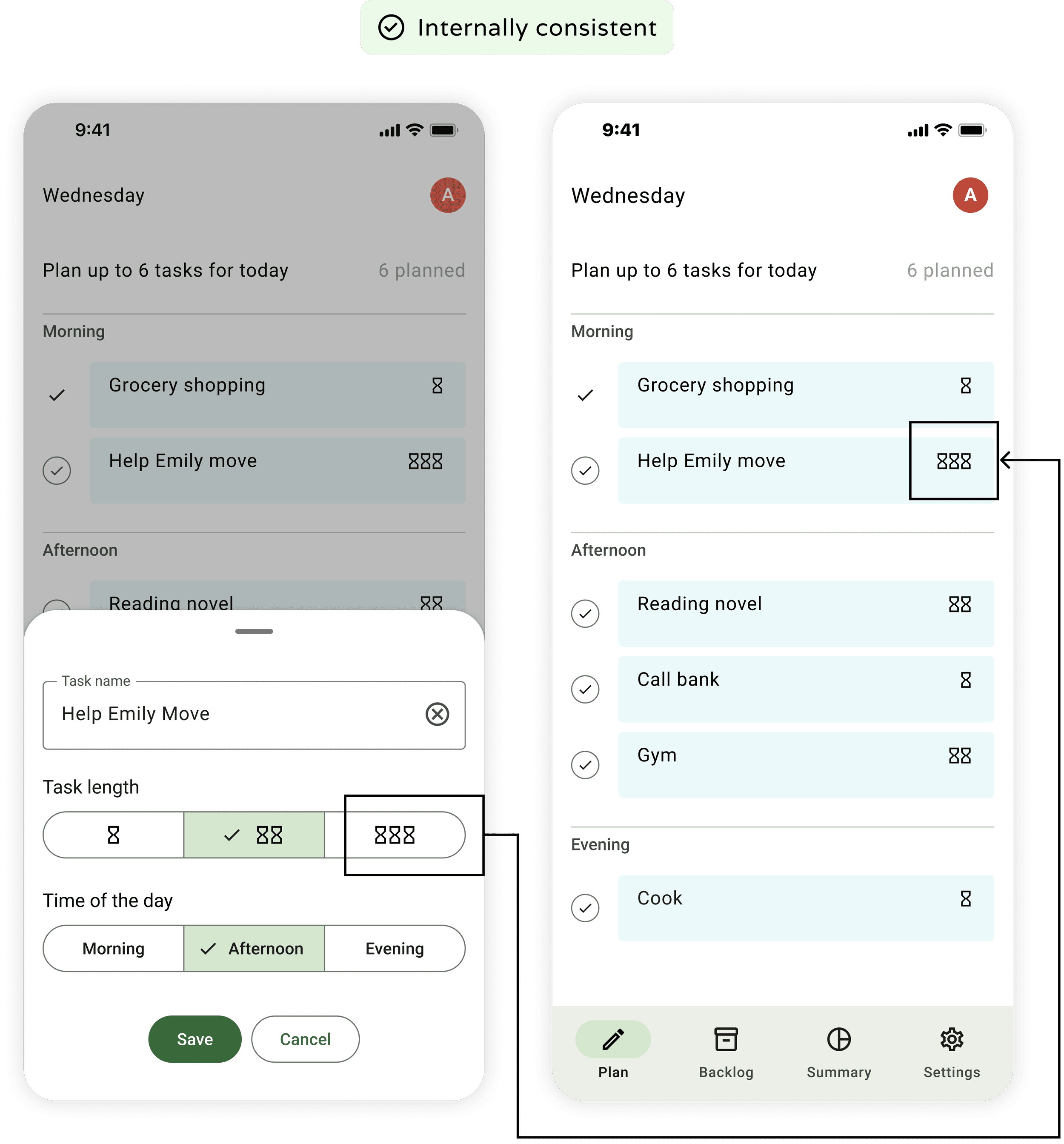
V uses Google’s segmented button instead of a slider bar to allow the user to set a task as either short, medium, or long.

Copy Turned into Icons
At first, the segmented button displayed words.
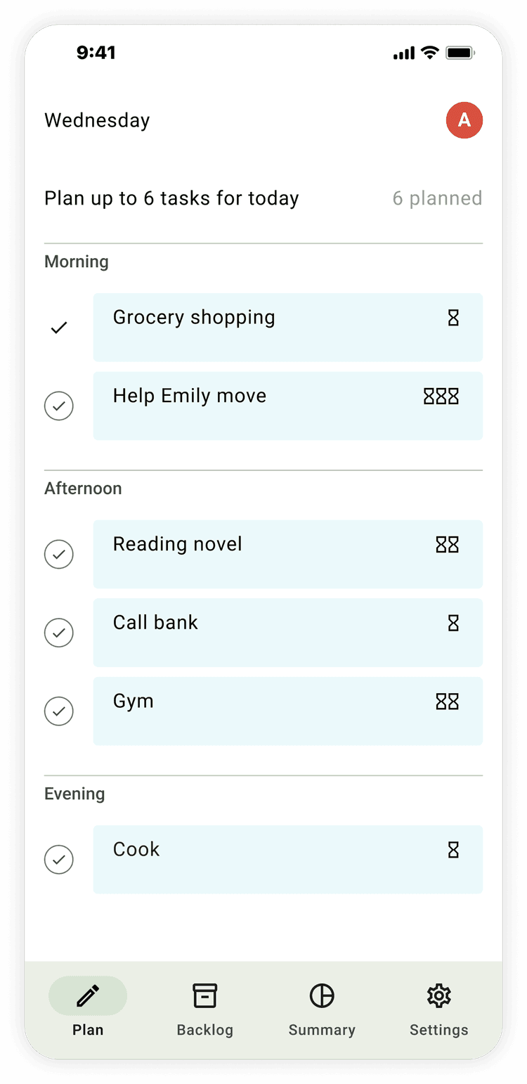
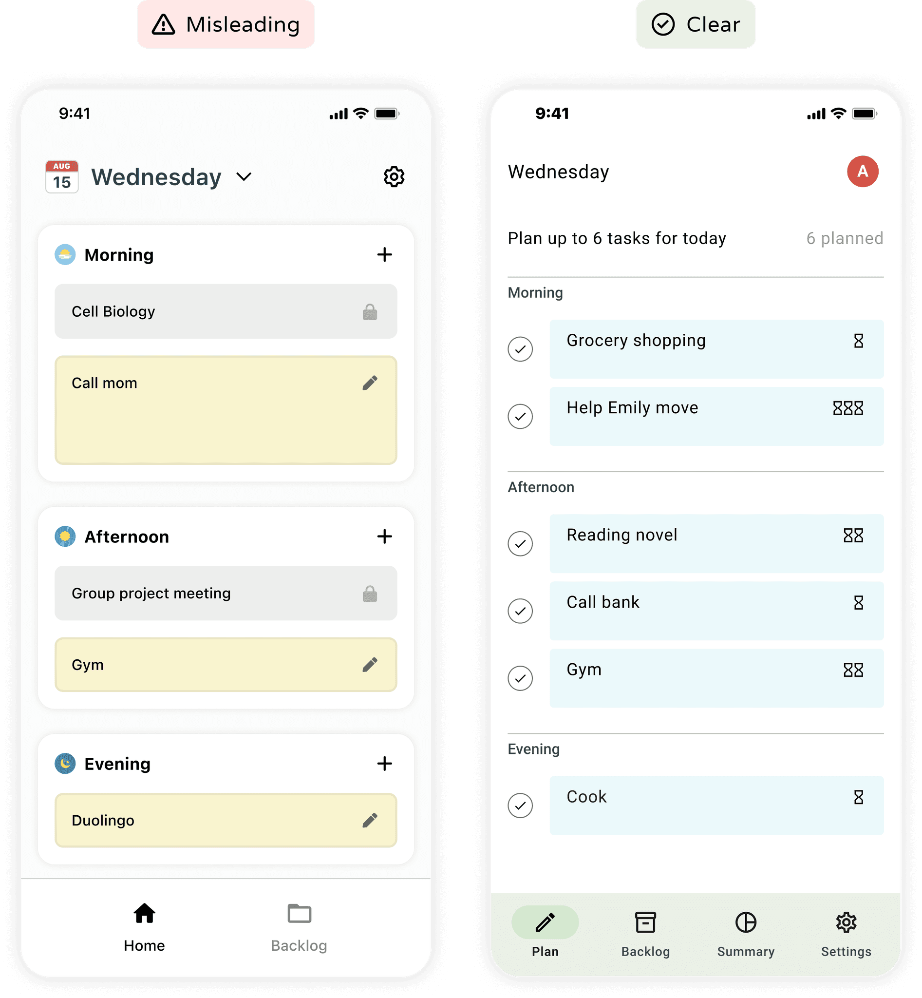
Ultimately, I used hourglass icons to indicate task durations on the app’s home page instead of varying tile heights. Because tile heights, commonly used by calendar apps to display exact times, could be misleading.
Now that approximate task durations are indicated by icons on the home page, they must also be communicated by icons on the pages for adding or editing a task in order to create an internally consistent user experience.
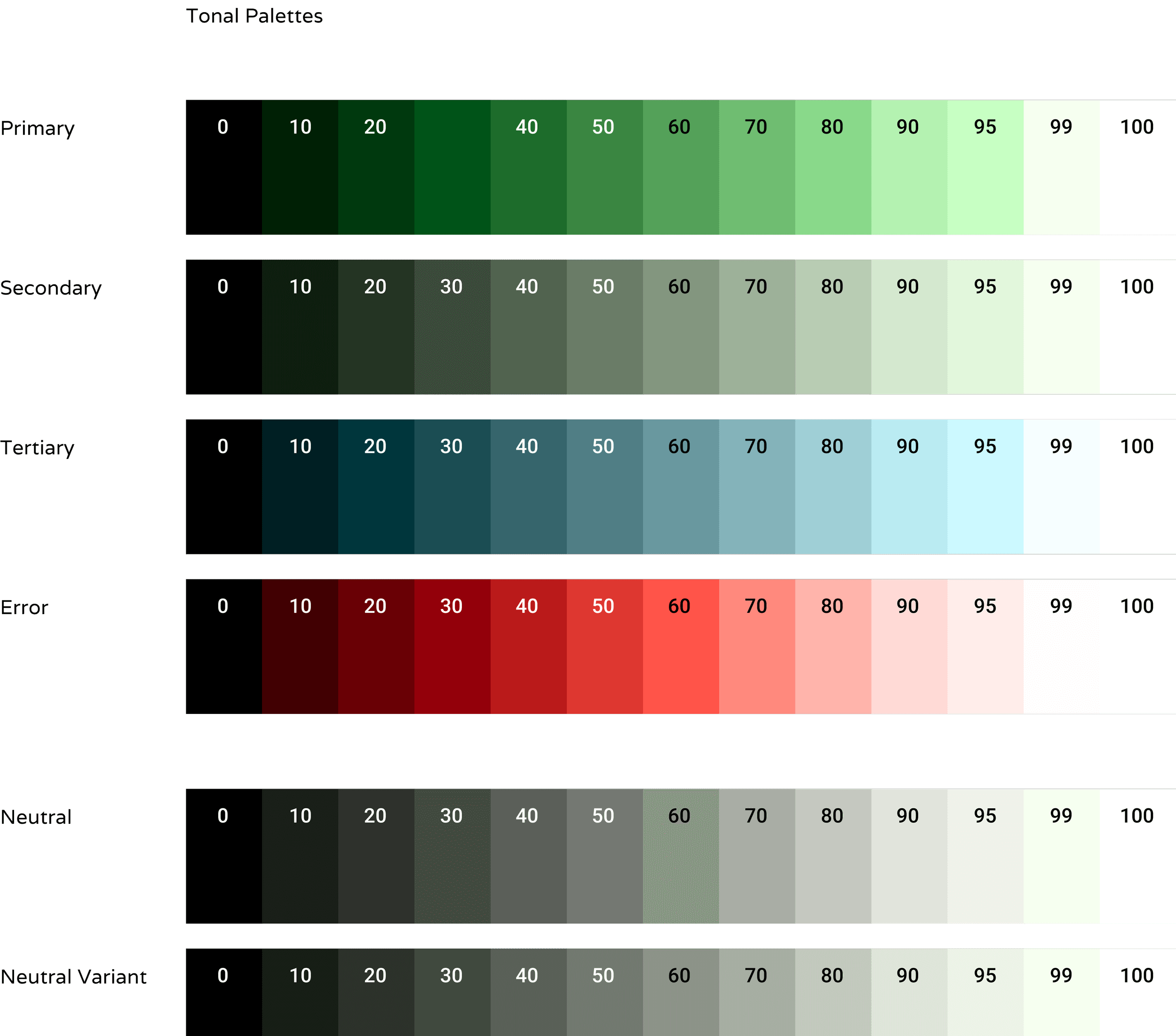
Color
Ruth Kedar, the designer behind the iconic Google logo, on choosing colors for the logo:
"We ended up with the primary colors, but instead of having the pattern go in order, we put a secondary color on the L, which brought back the idea that Google doesn't follow the rules."
Google Planner adopted the “secondary color on the L” as its primary color to honor the app’s rule-breaking creativity as a productivity tool that urges users to accomplish more by planning less.
REFLECTION
Takeaways
Deliver & revise
Participating in this 1.5-day Hackathon was my first taste of rapid ideation. The short time frame forced our team to take ideas out of our heads and start drawing fast and frequently. Doing so made me realize that prototyping early and quickly was not only feasible but also could be an overall beneficial practice that, as obvious as this may sound, helped us brainstorm designs by visualizing and comparing different options.
Design systems still leave space for creative freedom
When I first entered UX, design systems were the “AI” of the time: some designers feared that design systems would ultimately render many UX design roles obsolete. However, working with Material You showed me how many design problems were still left unsolved and how many creative choices were left open despite working with a design system. Just like having a dictionary doesn’t automatically make one a poet, design systems do not negate the magic designers cast to bring products to life.
more projects
